
Fitastic
A Gamified Fitness App
Fitastic is a fitness app that transforms the workout experience through gamification, making fitness engaging and fun.
Duration: 1 Month
Tools: Figma & Miro
My Role: UX/UI Designer & UX Researcher


What is the Problem?
Users show high engagement with the app during the first three weeks, but this engagement significantly declines afterward, often leading to app deletion. This pattern indicates that while initial interest is captured, the app fails to sustain long-term engagement and repeat usage.
What is the Goal?
The goal is to maintain long-term interest by incorporating personalized messaging and gamification to encourage consistent use, create a sense of accomplishment, and enhance the overall experience.

Approach
To approach this project a project plan was created. The project plan plotted a strict timeline, along with methods and deliverables for each phase.

Research
To gain a better understanding of the target audience and their pain points, secondary research will be conducted due to lack of time. Below are the research questions and methodologies that will be explored throughout the research.
QuestionsHow do users currently interact and share progress with their health and fitness groups outside the app?
What motivates users to share health and fitness goals and achievements with family or friends?
What specific messaging features (e.g., scheduled reminders, congratulatory messages, group challenges) would best support user goals and engagement?
How can the app’s design integrate messaging without disrupting the primary health-tracking experience?
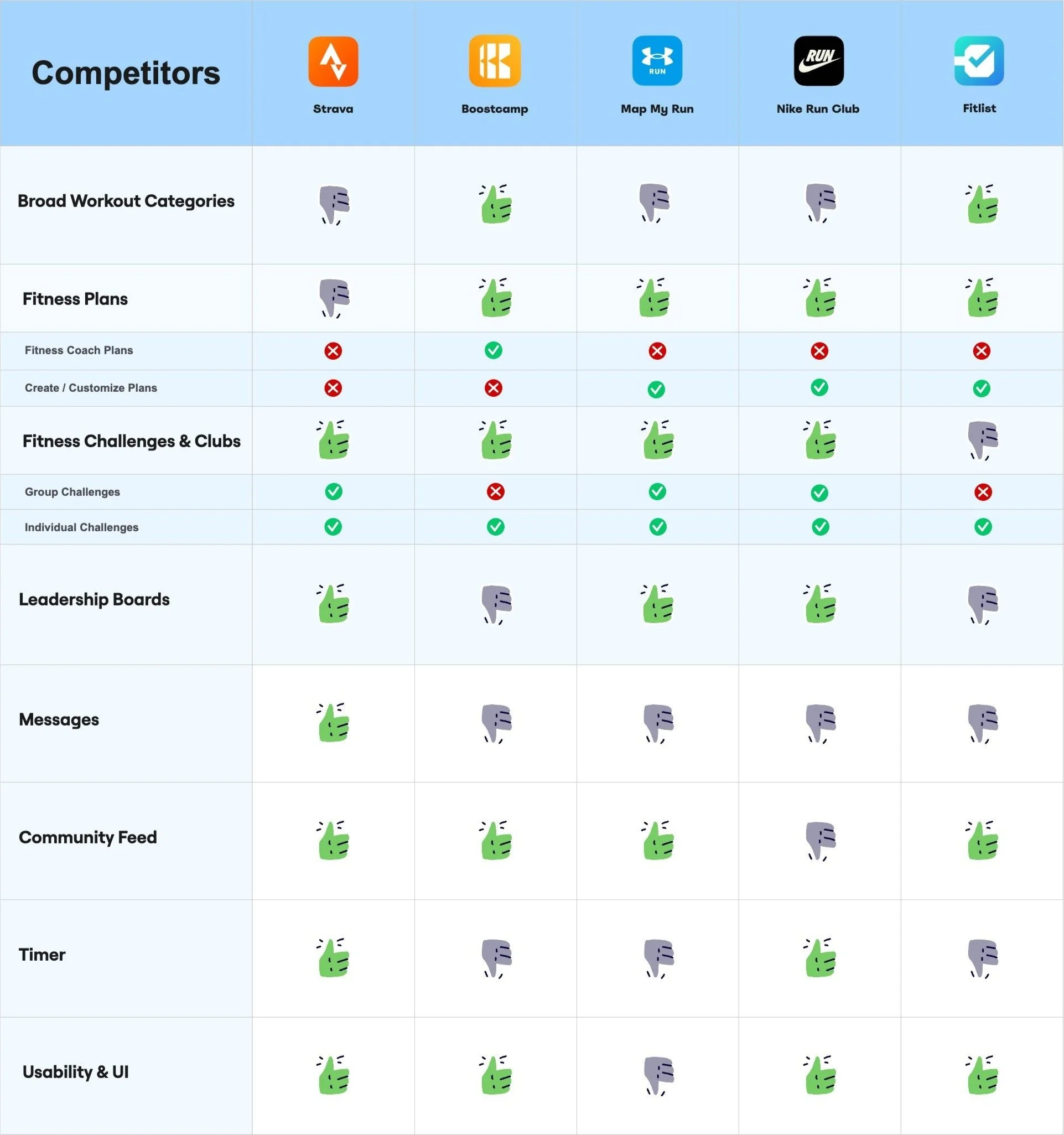
MethodologiesCompetitive Research: Find services related to Health & Fitness (Map My Run, Nike Run Club, Fitlist.)
Secondary Remote Research: Watch YouTube videos on fitness apps.
A quick Competitive Analysis will be done. Apps such as Strava, Nike Run Club, Map My Run, Fitlist, and Boostcamp were studied. Some key action items and market gaps were noted from each app.
Secondary Research
Key needs of fitness app users
Key Findings
Users can’t message their friends from fitness apps
Users like competing on fitness goals with their friends.
Users like sharing their fitness goals with their friends and community.
Users like to encourage and uplift each other while achieving fitness goals.
Users like following fitness plans.
Users like to keep track of their fitness.
Define
To gain a clear focus on what users need, HMW questions and the JTBD framework will be created. This approach will emphasize identifying market gaps in other products and addressing the key problems users are facing.
The "How Might We" (HMW) framework will be used to define the app's overall objective. It helps clarify the goal the product aims to achieve for its users. HMW statements will be derived from key insights gathered from empathy maps and personas.
HMW Questions
1. How might we enable users to stay connected with others through messages and foster competition around fitness goals?
2. How might we help users share their fitness goals with friends and the community while motivating and supporting each other?
3. How might we help users follow fitness plans while easily tracking their progress?
4. How might we transform the fitness journey into a fun, engaging, and gamified user experience?
The "How Might We" (HMW) framework will be used to define the app's overall objective. It helps clarify the goal the product aims to achieve for its users. HMW statements will be derived from key insights gathered from empathy maps and personas.
JTBD

Design/Iterate
During this phase, the app will start to get executed. The basic structure of the app will be built by making user flows. Later, user flows will be developed into a Mid-Fidelity prototype, serving as a rough execution of the app’s layout. Wireframes from the existing app’s screens will be revised for better usability and conversation rates.
Improving the Information Architecture
The existing information architecture will be revised to optimize usability and boost conversion rates. New features will be added, and modifications will be made to the existing ones.

New Site Map:Messages will be introduced to the app, allowing for more user engagement and repeated usage. They will be placed on the top status bar next to notifications.
Community/Groups will replace notifications. It consists of Community fitness challenges and community feed, which will be added to expand gamification and user communication.
The map page will be designed from scratch. No loose wireframes or instructions were provided.
Changes to the profile, home, and events page will be made.
Improving the Event Screen
The event screen was missing so many key details about the event.

Before:
Many key details such as location, date, and event description, are absent,
The CTA button “RSVP” is not suitable when the user hasn’t joined the event yet.
The missing details will be added.
CTA Button to send this event will also be added.
“RSVP” will be rephrased to “Book Now”.
After:

A quick interview will be conducted before redesigning the profile page. This primary research will help to understand what kinds of things users want to see on the profile page of a fitness app.
Improving the Profile Screen

Before:
The graphs and illustrations lacked context.

Reports of daily steps, calories, and heart rate were added.
The bar graph will now represent the intensity, duration, and frequency of physical activity.
After:
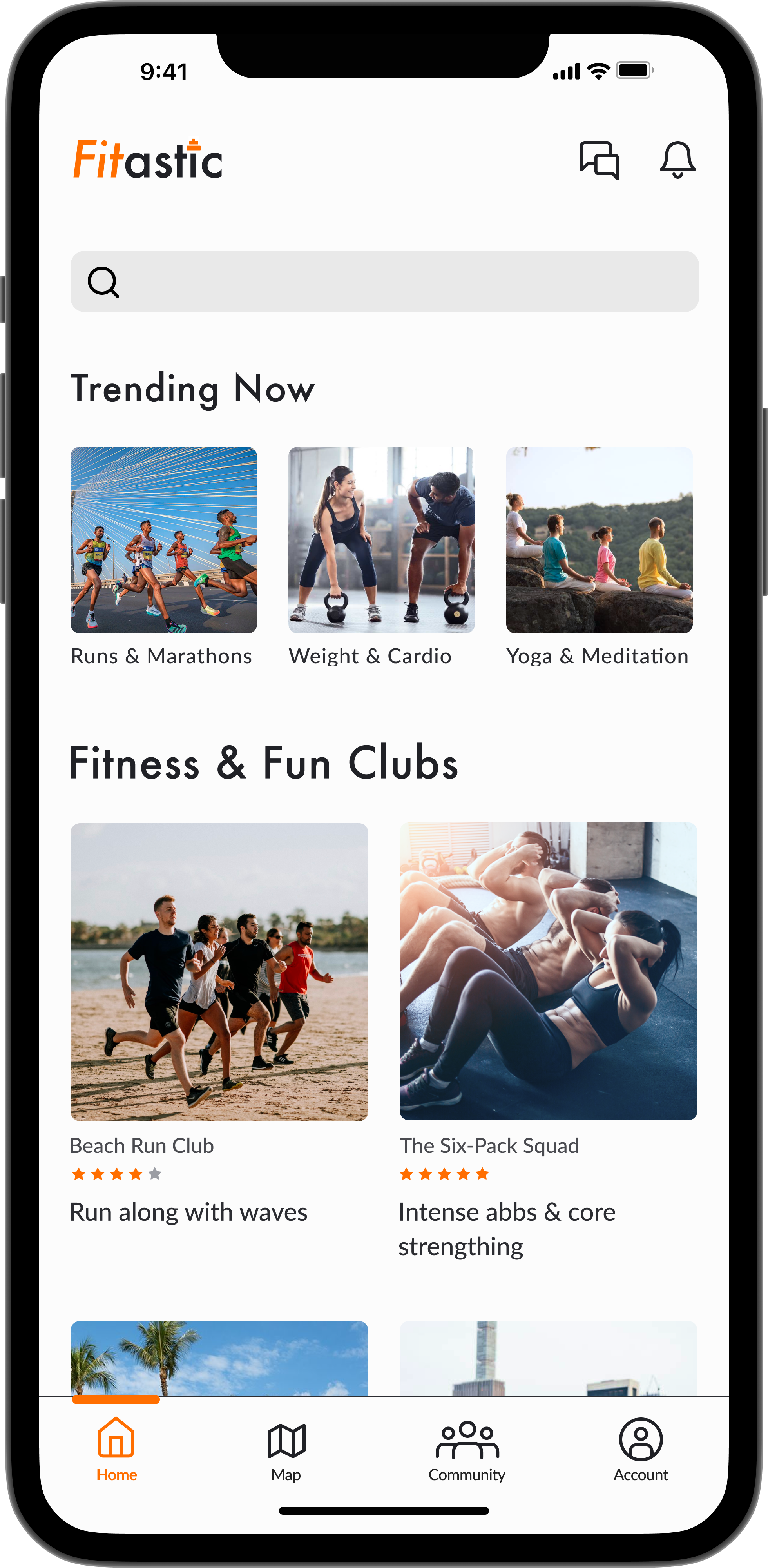
Improving the Home Page
Categorization and title phrasement will have to be improved.
The " People " category seems oddly placed alongside other fitness activities. There isn’t any context for what it consists of either.
The title “Fitness and Run Clubs” doesn’t align with the activities listed under it, as not all the clubs are focused on running.
Before:

The “People” category will be cut off due to lack of context and being a misfit.
“Trending Now” will feature popular exercises to inspire users and boost engagement.
“Fitness and Run Clubs” will be renamed “Fitness & Fun Clubs” to better reflect the variety of categories.
After:

Since Fitastic consists of fitness events, a real-time map showing nearby events is going to be designed.
Designing the Map Screen

Reports of daily steps, calories, and heart rate were added.
The bar graph will now represent the intensity, duration, and frequency of physical activity.
User flows will be created to plan out a brief structure and navigation of the crucial tasks of the app.
Userflows

Flow 1: Send a workout challenge to a group chat.
Flow 2: Posting a fitness achievement into the community feed.

Flow 3: See the leadership board of a challenge.

Testing & Iteration
During this phase, mid-fidelity user flows will be tested to identify major usability issues early on. This approach helps avoid extensive rework later and reduces the need for significant iterations under tight deadlines.

Remote user testing with four users will be done to identify any major usability issues during an early design phase. Users will be recruited through Slack based on their interest in health & fitness. This testing will aim to uncover usability issues within red routes, dashboard screens, buttons, icons, and wording.
Mid-Fidelity Testing
Home
Dashboard
Event
Chat
Community
Testing Results
After conducting remote user testing, there weren’t any critical or major usability issues with it. However, users pointed out a few minor issues and some suggestions for improvement. Users found usability issues or suggested improvements for flow 1 and flow 3.
Users struggled to find the community feed and community challenges under “Groups”
Users suggested the leadership dashboards can still be improved and more user-friendly.
Iterations
Rephrasing "Groups" to "Community"Iteration: Rewording “Group”function in the bottom navigation bar.
Users found it confusing to view the community feed and challenges. They also thought "groups" referred to group messaging when asked to send a fitness challenge.
Before:
After:

“Groups” will be renamed to “Community” since it contains a community feed and community fitness challenges.
“Community” will prevent it from being associated with group chats.
Iteration: Implementing dropdown in leadership board.
Improving DashboardA user suggested to make the “Day 1” and “Day 2” dashboards as a carousel or a dropdown. Displaying them as a list can be a long scroll, a carousel, or a dropdown dashboard, will be more user-friendly.

Before:
After:

A dropdown dashboard will be designed, with each day having its dropdown to display the results for that specific day.
Hierarchy on the top three leadership dashboards will also be achieved by iterating the daily dashboard to a dropdown.
Light and dark-mode UIs are widely favored in fitness apps. Energetic and bold colors are paired with these modes to create striking, attention-grabbing CTAs. Pastel tones complement light mode as secondary colors, while dark muted shades are used for dark mode. Realistic imagery completes the aesthetic by providing an engaging and immersive look.
UI Inspiration
Branding Attributes: 
Energetic, Bold, and Encouraging
A mix of pastel and vibrant color palettes has been selected. Pastels will be used for UI cards or to highlight secondary information. Bright orange will be reserved for CTA buttons and other key elements. Accent colors will be applied to bar graphs, charts, and statistics. minimalist and modern typography will be used.
Styleguide

Color Palette: 
Typography:
Common Components:High-Fidelity
The design system and imagery will be implemented to the mid-fidelity.


Remote user testing with four users to identify any usability issues. Testers will be recruited via Slack channel. Anyone who expresses interest in health & fitness will be asked to participate in a 30-minute user test. This testing will aim to uncover any usability issues within the user flows after the high-fidelity.
User Testing 2 / Iterations 2
User Testing Results
Users struggled to send out a fitness challenge to a group chat.
Iterations
Improving AccessibilityIteration: Adding a check mark to indicate selection.
Once these were tested as high-fidelity all the users didn’t find clicking the “send” CTA intuitive. They claimed they thought it would automatically be sent upon clicking the chat.

Before:
After:

A check mark will be added to suggest that the chat is being selected.
Users can select multiple chats simultaneously, making it easy to send messages across several chats efficiently.
Iteration: Improve the hierarchy and functionality of the leadership board
Improving DashboardAlthough users had no issues with the previous leaderboard screen, it will still be iterated to improve hierarchy and usability.

Before:

After:
To distinguish the top three participants, they will be displayed on a UI card of their own, with a crown on the top. This playful element will gamify the experience even more.
The performance breakdown will be divided into three categories: All Time, Today, and Weekly. All Time will showcase the cumulative results of each participant over time. Today will display results for the current day only, while Weekly will organize daily results within a dropdown menu for easy navigation.
Prototype
Below is a prototype of some main userflows.
This project provided a valuable opportunity to improve an existing product by iterating based on user feedback. I successfully aligned user needs with business goals, enhancing both usability and measurable outcomes. In the future, I plan to conduct more user research and testing for the map and account screens. Developing user flows for these screens would also be a valuable addition to this project.