
WanderEase
WanderEase is a travel app that simplifies travel planning and avoids unsatisfactory travel experiences.
An All In One Travel App.
Duration: April 2023 - September 2023
Tools: Figma & Miro
My Role: UX/UI Designer & UX Researcher


What is the Problem?
Planning travel can be frustrating due to the overwhelming number of platforms and unreliable reviews, leading to unsatisfactory experiences. Additionally, the difficulty of planning effective itineraries, coordinating communication, and expense management during group trips aggravate challenges. How can planning travel experience be simplified in a way where unsatisfactory travel experiences can be avoided?
How can it be Solved?
To address this challenge, WanderEase, a travel planning app, will be developed to streamline the travel planning experience. The app will feature a range of functionalities, including accommodation and activity bookings, expense tracking and management, AI-driven assistance, and an integrated messaging system. These features aim to simplify and enhance the overall travel planning process for users.

Approach
The project will begin with research to identify user needs and pain points. Insights will guide the creation of sketches, wireframes, and high-fidelity mockups. Prototypes will be tested to uncover usability issues, followed by iterative refinements based on user feedback to ensure a seamless experience.
Research
To understand the users, their pain points in planning travel, and the factors contributing to unsatisfactory travel experiences, both secondary and primary research will be conducted. The objective is to gain insights into the target audience, their frustrations, and the aspects of travel planning that work well or fall short for them.
Secondary Research
Observations from Quora stories, articles, and travel blogs reveal two main types of travelers: those who travel for leisure and those who travel for business. Leisure travelers show greater potential as a target audience, as their travel experiences are more influenced by controllable factors compared to business travelers. Common challenges faced by leisure travelers include poor itinerary planning, mismatched expectations, communication issues among group travelers, and expense management difficulties. Considering these factors, the app's primary target audience will be leisure travelers.

Primary Research
To identify user pain points, five individuals will be recruited and interviewed. Participants were selected from a Slack group using a screener survey and represented a diverse demographic range, including various ages (20 and above), genders, and travel types such as solo, group, or family travelers. The interviews will focus on achieving the following objectives
What platforms do travelers use?
What is their travel planning process like?
What do they find challenging while planning travel?
What works and what doesn’t while planning travel?
What were the causes of their unsatisfactory travel experiences?
“One thing that frustrates me is the amount of bouncing back and forth on various platforms.”
- Jennie Mason
“When it comes to finding travel inspiration and reviews most experiences on social media are inflated ”
- Sorrel Park
“Communication within the group is hard due to people not keeping up and being indecisive”
- Darren Yang
“Keeping track of finances and splitting expenses is also another challenge when I travel with my friend group”
- Sorrel Park
Key Findings
People get frustrated while bouncing between numerous platforms while planning their travel.
Many travelers plan itineraries on arrival, but since they have limited knowledge of the local environment.
Planning Travel
Travelers rely on social media for trip inspiration and reviews.
People have high expectations after seeing travel experiences on social media.
Communication is hard with group travelers while planning the trip.
Splitting money is also hard for group travelers.
Group Travel
Trip Inspiration / Reviews
Data Synthesization
Many UX methods will be used to analyze the research effectively. This includes Affinity mapping, Empathy mapping, Personas, and How Might We questions. These steps will organize insights, understand user behaviors and needs, create user-centric solutions, and frame actionable design opportunities.
After conducting user interviews, notes, quotes, and stand-out phrases will be jotted down. They will be categorized into themes.
Affinity Map

Key Takeaways
Travel Inspiration/Reviews:
Users rely on social media reviews for travel inspiration. Social media often exaggerates experiences, creating inflated expectations that can lead to disappointment when reality falls short.
Travel Itinerary:
Users often switch between multiple platforms while planning their travel and struggle to visualize the destination's environment, making it difficult to determine if their itinerary will align with it or not. In cases such as this, users end up planning their itinerary upon their arrival at the destination.
Money Management:
Money management is a major challenge, particularly during group travel. Splitting payments fairly among group members can be frustrating, and users often struggle to track their expenses while budgeting for trips.
Group Communication:
Users find decision-making to be the most challenging aspect of group travel. Group members often struggle to keep up with discussions, share their opinions, and coordinate plans that fit everyone's travel preferences.
An empathy map of a group traveler will also be made to understand what it feels like while planning a trip. This method provides insights into the user’s priorities, such as convenience, affordability, or seamless coordination, guiding the design of user-centric travel solutions.
Empathy Map
Empathy Map of Solo Traveler
Empathy Map of Group TravelerPersonas
After creating empathy maps, personas will be created to empathize more with the users. These will serve as a storytelling resource for this project.


The "How Might We" (HMW) framework will be used to define the app's overall objective. It helps clarify the goal the product aims to achieve for its users. HMW statements will be derived from key insights gathered from empathy maps and personas.
HMW Questions
How might we help users plan an effective trip and activities?
2. How might we help group travelers communicate better during travel planning?
3. How might we help group travelers manage their expenses effectively?
4. How might we help users to find trusted travel content and reviews?
Ideate
During this phase, the app will start to get executed. The basic structure of the app will be built by making user flows. Later, user flows will be developed into Low-Fidelity sketches, serving as a rough execution of the app’s layout. After that, Mid-Fidelity will be made providing a fleshed-out starting point for High-Fedility.
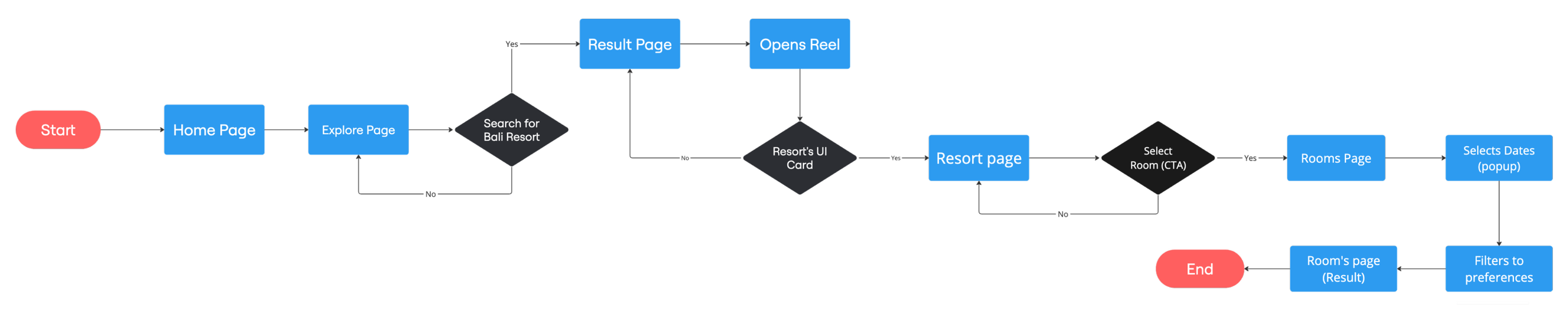
User flows will be created to plan out a brief structure and navigation of the crucial tasks of the app.
Userflows
Flow 1: Finding inspiration for the Bali trip, looking at resorts and villas.
Flow 2: Book a resort using splitpay.

Rough sketches will serve as a quick way to visualize ideas, explore multiple concepts, and establish the basic structure and hierarchy of the interface.
Low-Fidelity Sketches

Home Page
Explore Page
Explore (Reels)
Reel
Rough sketches will serve as a quick way to visualize ideas, explore multiple concepts, and establish the basic structure and hierarchy of the interface.
Mid-Fidelity Wireframes
Plan Page
Home Page
Travel Group
Budget Plan


While planning the trip the users should feel trusted of the platform, encouraged, excited, inspired and organized. The images, illustrations, and other UI examples below from the moodboard is a perfect identity for WanderEase. The platform should encourage them to explore possibilities, sparking excitement and inspiration as they visualize their upcoming adventures. A seamless and organized planning process is key to reducing stress and making the experience enjoyable.
Branding

Branding Attributes: Reliable, Exciting, Inspirational, and Organized.

A vibrant and refreshing color palette will be paired with light and minimalist fonts. This will give the interface an energetic yet elegant feel, ensuring a visually appealing and user-friendly experience.
Styleguide
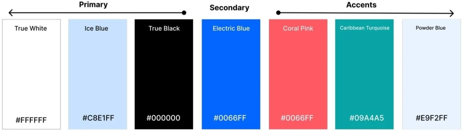
Color Palette: 
Typography:Icons:
Common Components:High-Fidelity
Wireframes will be made to get the execution started of the product.


Testing & Iteration
During this phase, the app will start to get executed. The basic structure of the app will be built by making user flows. Later, user flows will be developed into Low-Fidelity sketches, serving as a rough execution of the app’s layout. After that, Mid-Fidelity will be made providing a fleshed-out starting point for High-Fedility.
Remote user testing with 4 users to identify any usability issues and classified them based on their severity will be conducted. Testers will be recruited via Slack channel. Anyone who expresses interest in travel planning and travel will be asked to participate in a 30-minute user test. This testing will aim to uncover any usability issues within the red routes.
User Testing / Iterations
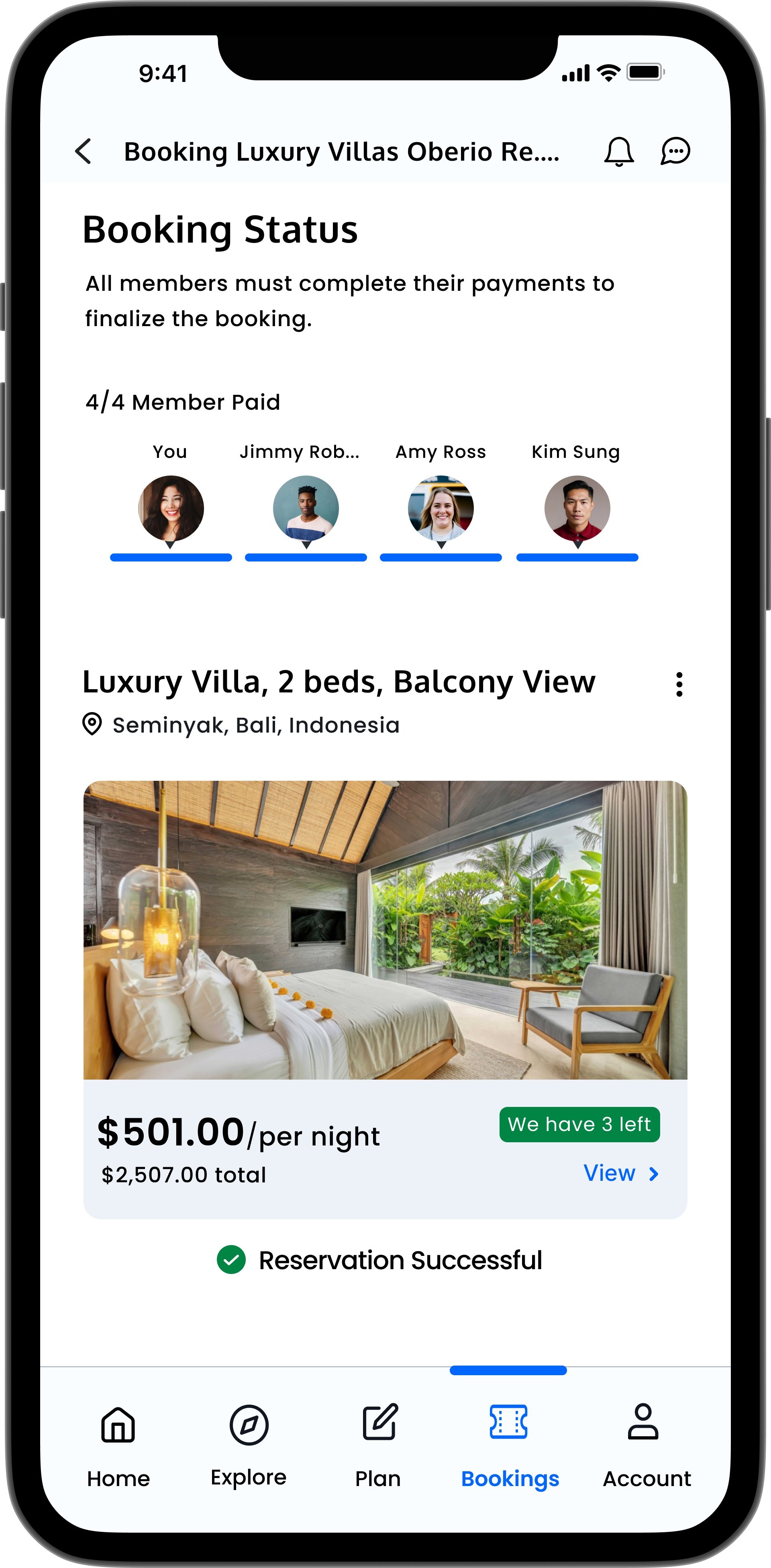
Users found accepting the two-step group booking confusing.
Users couldn’t figure out the toggle button on the budget screen.
Users struggled with the add button. They thought people would immediately added to the group once they tapped on upon searching.
Users found the payment options screen inconvenient due to the heavy text information.
User Testing Results
Iterations
Iteration: Two-step acceptance to a group event was iterated to one step.
The initial process had users join the event group in first step and confirm attendance later, but they mistakenly thought joining was a final confirmation.
Accepting attendance will now be a single step, placed at the top of the page to align with users' top-to-bottom scanning behavior.
Withdrawing from the event will now become part of a dark pattern.
Dark Pattern: To withdraw from an event, users must click the kebab menu next to the event's name. This approach is expected to reduce withdrawals and increase booking rates.
Two-step acceptanceIteration: The toggle switch was spaced from the budget section, decreased in width, and changed in shape, color, and wording.
Users had difficulty recognizing "Activity" and "Estimate" as toggle buttons. Additionally, they misunderstood "Activity," assuming it referred to their planned activities for the trip rather than their financial activity of total spending.
The toggle switch will change in shape and color and be separated from the budget section to appear more distinguished from other screen elements.
The term "Activity" will change to "Spendings" to better align well with the financial context. Icons will also be added to provide users with clearer guidance on the button functions.
Toggle SwitchBefore:
After:


Before:


After:
Iteration: The add button was removed. Members now get added as they are clicked on.
Some users struggled to operate the "Add" button for adding users to the travel group. They mistakenly thought members would be added immediately upon tapping.
The “Add” button will be removed and users will get added once they are clicked on.
Adding MembersBefore:
After:
Iteration: The payment option page was entirely redesigned.
Users were overwhelmed by the heavy amount of textual information that was presented. Distinguishing between the two options wasn’t quick.
The payment options will now be presented as two CTA buttons. All users reported that the phrases “Split Pay” and “Single Payment” were straightforward and required no additional explanation.
The user will also have the option to select their payment method, and a UI card displaying the resort details will be shown.
The redesigned screen simplifies the user experience by combining three key functionalities—resort details, payment method, and payment option—into a single page, reducing user tasks by half.
Payment OptionsBefore:
After:


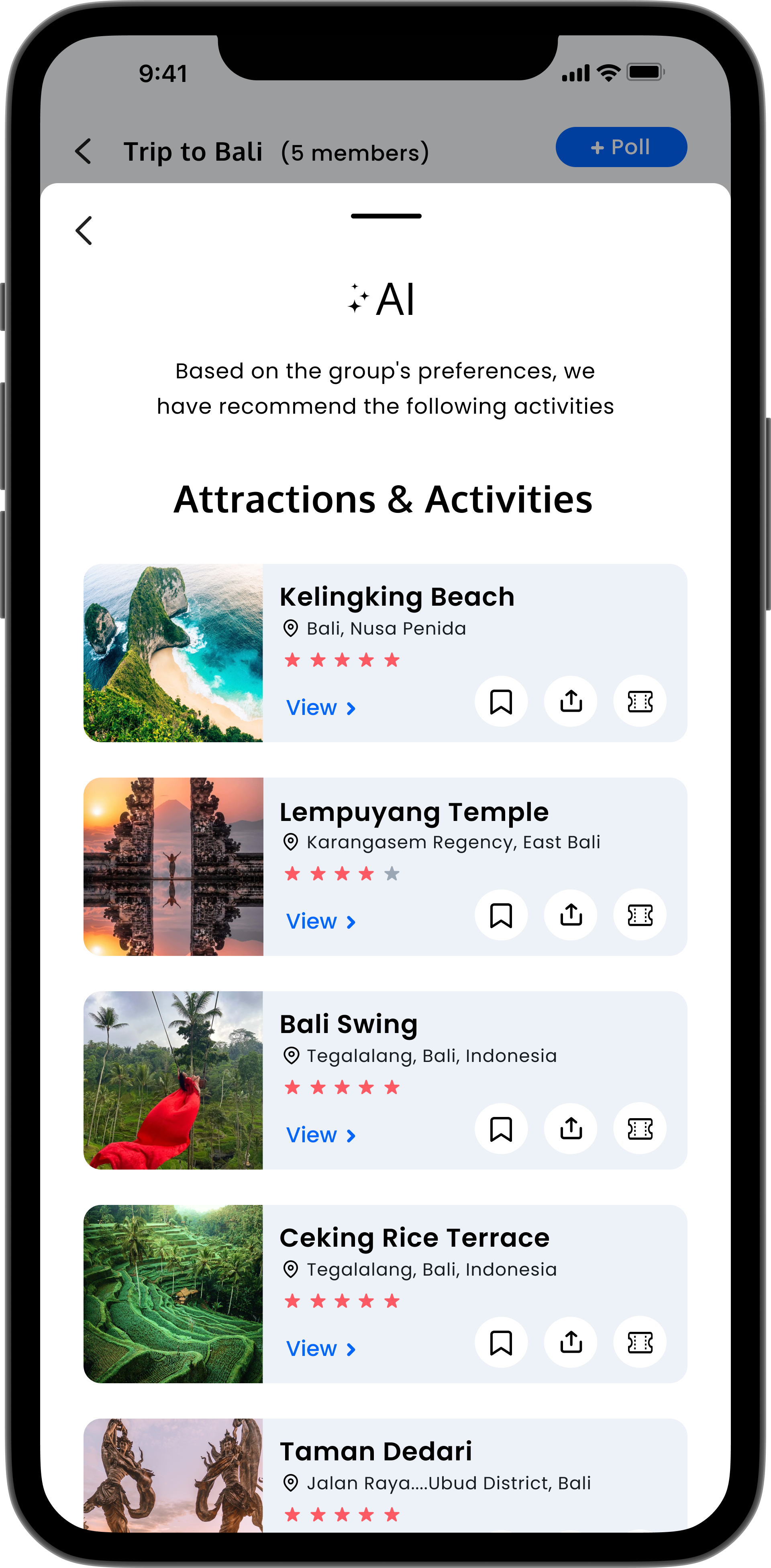
Prototype
Below is a prototype of some main userflows.
Learnings & Takeaways
This project provided valuable insights into effective research techniques, including crafting research questions and employing various synthesis methods such as personas, empathy maps, HMW questions, and JTBD. Additionally, it involved learning how to conduct user testing and follow a structured UX approach, making the experience both educational and rewarding. In the future, I want to improve the group booking user flow while conducting user testing and user research.